

Smaller than a parcel, quick like metatarsal, the boys at Pinch are bringing Payments to Newcastle!
We’ve learned a lot since the last time we exhibited at a Xero conference and it’s fair to say that we still have a long list of things to learn. Nonetheless, I wanted to put together a bit of a post on what we’ve done to prepare for the #XeroRoadshow and why we’ve made the choices we have.
Location, location, location
As it always seems to be, the most important decision to make was which locations to attend. The point of the roadshow is to get as local as possible and bring the full force of Xero and its App Partners right to your door. In an ideal world we would have visited every single location, especially the more remote ones, and chatted to as many locals as we could. Unfortunately, not only is that too time consuming for a tiny company, it’s also far too expensive.
As you would expect the major cities have the largest predicted turnout and therefore the largest cost. $1500 to be exact. Next are the secondary cities like the Gold Coast and my local stomping ground, Newcastle, costing $900. Finally, the more remote locations cost $500.
To balance cost, travel expenses and exposure, we’ve opted to do a local tour consisting of Brisbane, the Gold Coast and Newcastle. Cities we each live in and visit regularly. Our aim is to get to know our local businesses, and gain exposure through word of mouth. You should never pick a vendor based on location alone, but we hope that quality local products are a selling point, especially for smaller businesses.
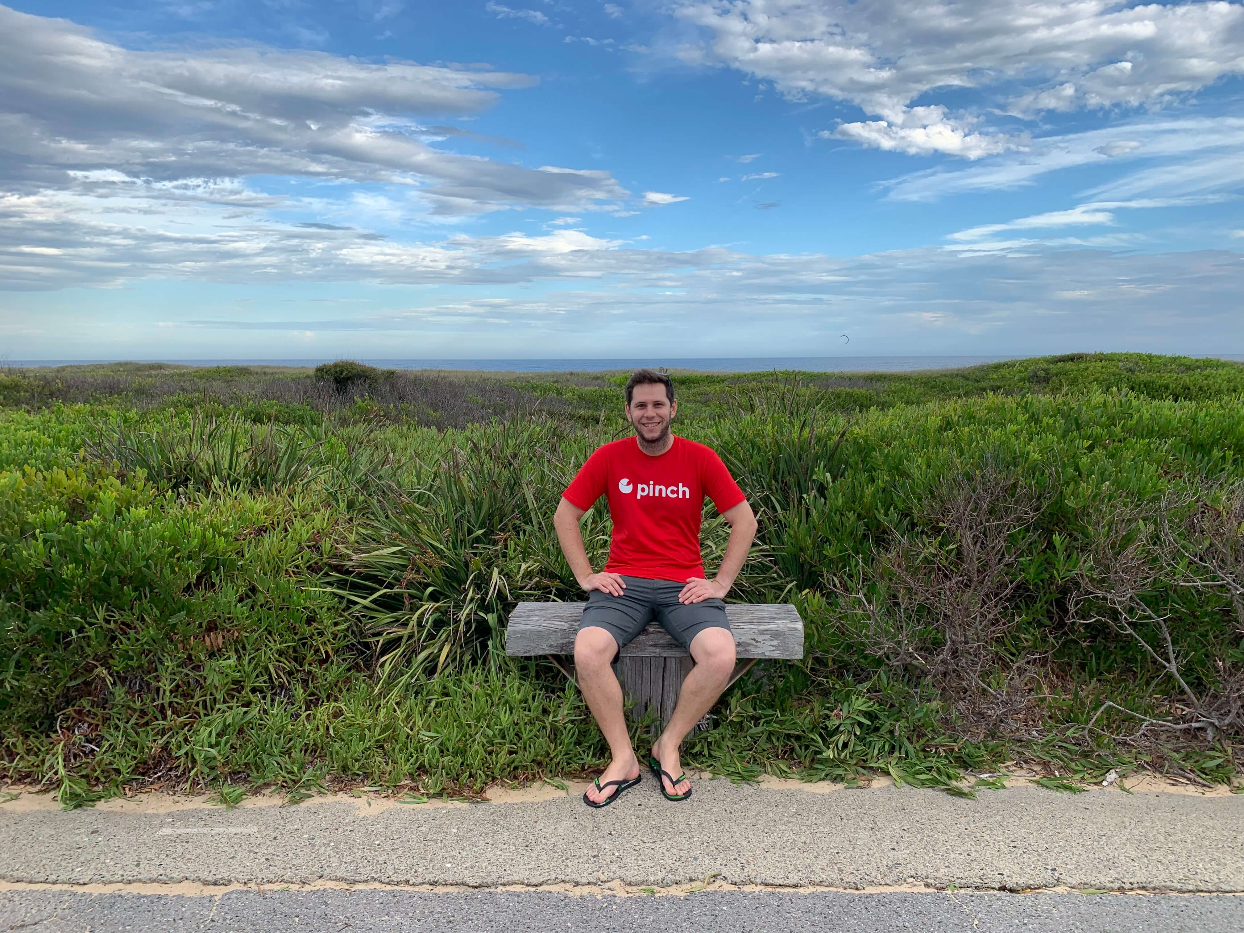
For me, this means meeting my fellow Novacastrians. If that’s you, come say hi! I’ll be in a bright red shirt, you can’t miss me.
It’s all in the marketing
Now that we know where we’re going to be, the next step is to get our marketing material and merch in order. These things take time, so you have to do it early.
First up are the flyers. As a tech guy, I’m not a fan of paper based materials. So much so that we had no printed material to give away at XeroCon 2018. A big lesson I learned is that people just want something tangible they can read when they have a break. Conferences are a heavy load on mobile devices, internet can be spotty, and sending people to the website when they want more information can sound pretty cold.
So this time we’ve prepared two flyers (really just one, back to back) that describe how our product works, and partnership opportunities for accountants and bookkeepers. We don’t really have a company style guide, so I’ve altered some bought templates to suit our needs.
Once we had some info to giveaway and a bit of a design template to work with, the next step was to design the stand banner. Since the roadshow is pretty intimate, there’s no flashy booth or anything like that. Just a small cocktail table and room for a banner.

This is actually the first stand banner I’ve ever designed, and it needed to accomplish three things: Attract attention, represent the brand (which admittedly is only the logo at the moment) and relay information about what we do at a glance. There’s only room for one banner, so this is a compromise of form and function.
To break down the design decisions:
- There’s a big logo at the top to make it immediately obvious what our company name is. Only when you’re well known enough can you start to minimise your brand name.
- We use a simple tag line to frame the rest of our information. Sometimes we’re mistaken for an AP payments company, rather than an AR one.
- Next, in order of importance/gravity we have the bottom tagline. This is our standard tagline and should filter people walking past. They should either be interested or not after reading this.
- The footer is readble at a couple of metres and mostly just gives away the URL.
- The image being black and white helps the coloured content pop, and makes the text a little easier to read. It’s supposed to represent being relaxed because we automate a bunch of things, but I’ve had mixed feedback on the actual image itself. I do like having a face in it though, as it helps attract attention.
- Next we have the basic workflow. This is often what I’m explaining to people when talking to them, so I’m hoping this helps.
- Lastly, we have some testimonials at a purposely small size. This will hopefully attract people to come closer to the banner to read it, and therefore within talking range. Doubles as a trust builder too. We’ll see if it’s effective or an annoyance.
Next we have the merch which in our case, true to my heart, is a stubby cooler:


It’s a bit of a case of giving away what I’d want myself, which is probably not the best idea, but I hope it’s inoffensive enough and practical for many people.
Lastly, and probably the most difficult to do well are the shirts that we’re going to wear. The shirts need to stand out, follow brand and advertise what we do (when you’re unknown). Luckily, I was able to use the feedback and experience from XeroCon last year to improve upon our designs.
For comparison, here’s the shirt we wore to XeroCon 2018.

and here’s my new deisgn:

One of our biggest problems was being called “Get Paid” as if it was our company name. In my first iteration I was too focused on explaining what we did that I neglected the brand name. Black (and white) is also the easiest colour to whack a logo on, so we got lost in a sea of black t-shirts with logos.
This year I’ve swapped the brand name to the front and moved our tagline to a stylised design on the back to make perfectly clear what the name is and what the tagline is. I have the claw logo on the front and back for easy identification from a distance, and obviously gone for a glaring bright red shirt colour to burn people’s retinas as we enter the room.
What will we talk about?
After all the preparation is done to make sure we’ll arrive and look the part, it’s time to think about what we want to achieve with our time at the roadshow.
I’ve found this a little difficult to predict when it’s your first time at an event, especially when you don’t know what the attendees’ expectations are. Mostly, we’re happy just to spread awareness of our solution and talk to people about their pain points. We can then see how best we may be able to help, and potentially give them a hand getting started on the spot.
For many others though, dealing with people’s money requires a lot of trust and if showing up in person is just one indicator that we’re legitimate, then I’m OK to just hand out a flyer to get the ball rolling on that trust.
Some other ideas that have been floated include, having a competition to attract some attention, include an on-the-spot only discount if you sign up at the roadshow, and booking demos with people so they can come back later and get our full attention. All of which are cool ideas, but I’m not sure if I’ll have time to implement.
Follow-up!
Though the event hasn’t even started, we need to know how we’ll follow up. In our case it’s about how we’ll categorise and note the people we talk to so that when we go to make follow up calls and emails, we haven’t lost the intricacies of our discussion. In the past, we’ve had MANY different and niche discussions with attendees, only to completely forget what we talked about, because we were rushing to talk to everyone during a flurry of activity and didn’t take proper notes.
Take better notes. That’s my main goal this time :)
If you have any ideas for conference booths, feedback on designs, or just anything to chat about in general, let me know on Twitter. I’m always keen to explore ideas.
See you soon!